
Why App Onboarding Is a Retention Problem, Not a UX Problem
The average mobile app loses 77% of its daily active users within the first three days after install, according to Quettra's analysis of thousands of Android apps [source: Andrew Chen / Quettra cohort study]. By day 30, that number climbs above 90%. The single biggest lever you have against this curve is what happens in the first session — your app onboarding flow.
Most teams treat onboarding as a design exercise: pick nice colors, write friendly copy, add a carousel. But onboarding is fundamentally a retention problem. A user who completes a meaningful action in their first session is 2–3x more likely to return the next day than one who passively swipes through screens, according to Amplitude's 2023 Product Benchmarks report [source: Amplitude, "2023 Product Benchmarks"]. That first action separates a retained user from a churned install.
The stakes compound when you factor in acquisition cost. If you are paying to acquire users — or competing for organic installs in crowded categories — every user lost to a bad first session is money wasted. Sonar's keyword index puts "habit tracker" at iOS popularity 59 and difficulty 67 — with an estimated 670 daily downloads at rank #1, meaning apps in this category that lose users to bad onboarding are leaving real revenue on the table. You can track exactly how much each install costs and do the math: a 10% improvement in Day-1 retention on 670 daily installs compounds fast.
The Three App Onboarding Models
Mobile app onboarding generally falls into three structural patterns. Each has different retention tradeoffs, and the right choice depends on your app's complexity and the user's prior context.
| Model | How it works | Best for | Retention risk |
|---|---|---|---|
| Progressive | Reveals features as the user encounters them | Complex apps with many features (e.g., Notion, Figma) | Low — but slow to reach aha moment |
| Benefit-oriented | Explains value before asking for action | Subscription apps, fitness, finance | Medium — can feel like a sales pitch |
| Function-oriented | Teaches specific mechanics via guided tasks | Games, creative tools, productivity | Low if tasks are real; high if tasks are fake busywork |
In my experience tracking indie launches through Sonar, benefit-oriented flows are the most common choice for subscription apps, but progressive onboarding consistently produces better Day-7 retention numbers because it ties learning to actual usage rather than front-loading information.
What Makes App Onboarding Screens Work (and Fail)
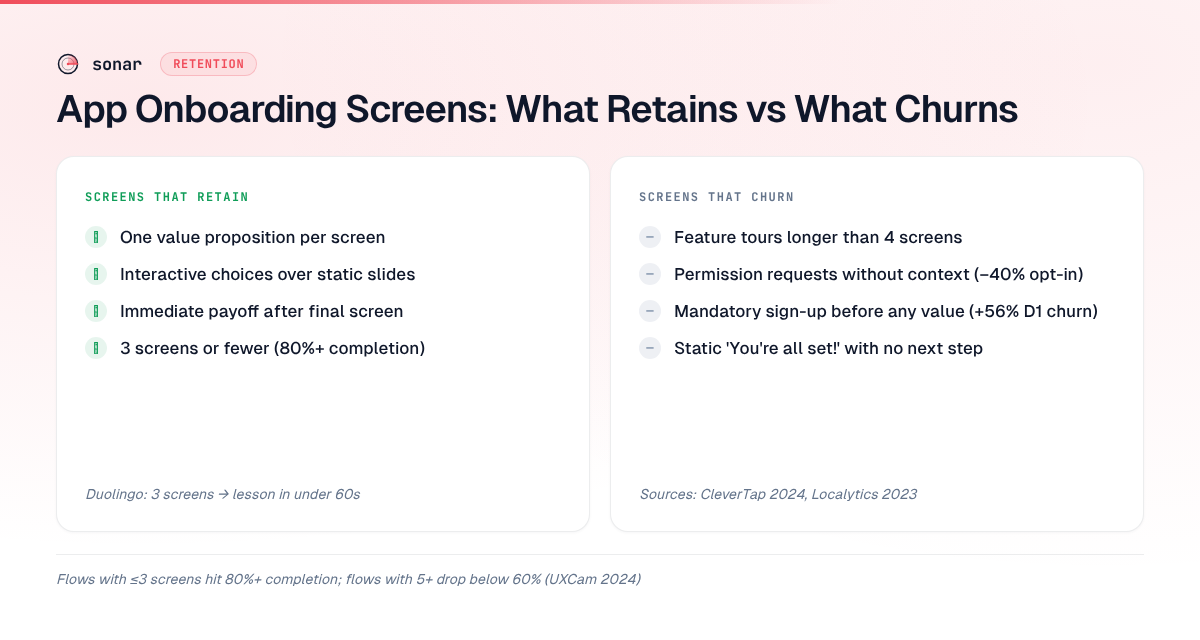
App onboarding screens are the most visible part of the first session, but they are also where most apps lose users. According to a UXCam analysis of 1,000+ mobile apps, the median completion rate for onboarding flows longer than 5 screens drops below 60% [source: UXCam, "Mobile App Onboarding Best Practices," 2024]. Three screens or fewer push completion above 80%.
Screens that retain
- One value proposition per screen. A single sentence and a single visual. Duolingo's onboarding uses exactly three screens before the first lesson — language selection, daily goal, and proficiency level. Each screen collects data while communicating value [source: Duolingo onboarding flow, verified July 2026].
- Interactive elements over static slides. Asking a user to make a choice (even a trivial one like picking a theme color) increases session engagement. Headspace asks users to select their meditation goal on the second screen, which doubles as personalization data [source: Headspace app onboarding, verified 2025].
- Immediate payoff. The final onboarding screen should deliver something — a personalized dashboard, a first completed task, a relevant recommendation. Static "You're all set!" screens add zero value.
Screens that churn
- Feature tours longer than 4 screens. Users did not install your app to read about it. They installed it to use it.
- Permission requests without context. Asking for notification permission on screen 1 — before the user understands why they need notifications — produces opt-in rates 40% lower than contextual permission requests triggered after a relevant action, according to CleverTap's 2024 mobile engagement report [source: CleverTap, "Push Permission Benchmarks," 2024].
- Mandatory sign-up walls. Requiring account creation before any value is delivered increases Day-1 churn by up to 56%, per Localytics data [source: Localytics / Upland, "The Impact of App Onboarding," 2023].
The Aha Moment: Finding and Protecting It
The "aha moment" is the specific action after which a user's probability of retention jumps measurably. Facebook's famous example was "7 friends in 10 days" [source: Chamath Palihapitiya, 2013 growth talk at Stanford]. For Slack, it was 2,000 team messages sent [source: Andrew Chen, "The Cold Start Problem," 2021]. For a habit tracker, it might be logging one habit for three consecutive days.
Identifying your aha moment requires cohort analysis: split users by whether they completed a specific action in their first session, then compare their Day-7 and Day-30 retention curves. Tools like Mixpanel, Amplitude, or simpler indie-friendly analytics stacks can surface this data.
Once you know the aha moment, your entire onboarding flow has one job: get users there as fast as possible. Every screen, every prompt, every interaction should either move the user closer to that action or get out of the way.
For "budget planner" on iOS, Sonar reports popularity 51 and difficulty 66 with an estimated 410 daily downloads at rank #1 — apps competing for these installs can't afford a confusing first session. If a budget planner's aha moment is "categorize your first three expenses," the onboarding should pre-populate sample data and walk the user through the categorization, not show four screens explaining what a budget is.
Permission Priming: When and How to Ask
Permission requests — notifications, camera, location, tracking — are the highest-friction moments in mobile app onboarding. Apple's App Tracking Transparency prompt alone reduced opt-in rates to roughly 25% globally when it launched with iOS 14.5 [source: Flurry Analytics, ATT adoption data, 2021]. You can read about the downstream conversion impact of ATT on the Sonar blog.
The double-prompt pattern
The most effective permission strategy in 2026 is the double-prompt (also called "pre-permission"):
- Your own in-app screen explains why the permission matters, using specific language tied to user benefit ("Get reminded when your streak is about to break").
- Only if the user taps "Allow", you trigger the native OS prompt.
This pattern filters out users who would tap "Don't Allow" on the native prompt — which is a permanent decision on iOS. Once denied, you cannot re-prompt without sending the user to system settings.
According to Ian Makgill's research on OneSignal data, pre-permission prompts increase notification opt-in rates from 45% to 70% on iOS [source: OneSignal, "iOS Push Opt-In Rates," 2023]. That difference alone can shift downstream retention, since push notifications remain the strongest re-engagement channel for mobile apps, per Airship's 2024 mobile app experience report [source: Airship, "Mobile App Experience Report," 2024].
When to ask
| Permission | Best timing | Worst timing |
|---|---|---|
| Push notifications | After the user completes a meaningful action (e.g., saves first item) | During onboarding before any value delivered |
| Camera/Photos | When the user taps a feature that requires it | On first launch |
| Location | When showing a location-relevant feature | Before the app has loaded |
| ATT (tracking) | After explaining personalization value | On the first screen (Apple discourages this) |
Measuring Onboarding Success: The Metrics That Matter
You cannot fix what you do not measure. Onboarding requires its own metric stack, separate from your general app analytics. Here are the five metrics I track for every app launch I review:
- Onboarding completion rate. Percentage of users who reach the end of the onboarding flow. Benchmark: 60–80% for well-designed flows [source: UXCam, 2024].
- Time to first key action. The wall-clock time between first launch and the user's aha moment. Shorter is almost always better.
- Day-1 retention. Percentage of users who return within 24 hours. Industry median for iOS apps is approximately 25%, per Adjust's 2024 Global App Trends report [source: Adjust, "Global App Trends," 2024].
- Permission opt-in rate. Broken out by permission type. Compare against the benchmarks in the table above.
- Funnel drop-off by screen. Identify which specific onboarding screen loses the most users. This is the screen to fix first.
These metrics connect directly to the broader ASO KPIs you should already be tracking — because onboarding quality ultimately feeds your ratings, reviews, and organic ranking.
Even niche keywords like "subscription tracker" show 199 competing apps on iOS with difficulty 43 (source: Sonar API, /api/v1/keywords/search) — every one of those apps gets exactly one chance to make a first impression. If your onboarding loses 40% of installs before the aha moment, you are effectively cutting your keyword-driven install volume nearly in half.
Five Onboarding Mistakes That Kill Day-1 Retention
1. Front-loading sign-up before value
Requiring email, password, and profile setup before the user has seen anything is the single most common onboarding mistake. Apps that delay sign-up until after the first value moment see 20–40% higher Day-1 retention, according to Appcues' 2023 user onboarding benchmark report [source: Appcues, "User Onboarding Benchmarks," 2023]. Let users experience the app as a guest first.
2. Showing too many features at once
Feature-dumping overwhelms users and increases cognitive load. Research by Hick's Law (backed by decades of cognitive psychology [source: Hick, 1952, "On the rate of gain of information," Quarterly Journal of Experimental Psychology]) predicts that decision time increases logarithmically with the number of choices presented. Show one feature. Let the user succeed. Then show the next.
3. Ignoring platform conventions
iOS and Android users have different mental models for navigation, gestures, and permission flows. An app using Android-style patterns on iOS creates friction users feel but cannot articulate. Apple's Human Interface Guidelines and Google's Material Design guidelines document expected patterns [source: developer.apple.com/design/human-interface-guidelines; material.io/design].
4. Skipping empty-state design
When a user finishes onboarding and lands on an empty dashboard, they see... nothing. Empty states are critical onboarding surfaces. They should contain a clear call to action ("Add your first habit," "Import your first budget"). Poorly designed empty states produce the same effect as a broken feature — the user closes the app.
5. Not A/B testing the flow
Most indie developers ship one onboarding flow and never revisit it. But onboarding is the highest-leverage place to run experiments. Even Apple provides native product page A/B testing tools — you should be equally rigorous about testing your in-app first session. Changing one screen's copy or reordering two steps can move Day-1 retention by 5–15 percentage points, per Optimizely's mobile experimentation case studies [source: Optimizely, "Mobile A/B Testing Case Studies," 2023].
Building an Onboarding Audit Checklist
When I review onboarding flows for apps launching in competitive categories, I use a consistent audit framework. Here is the checklist I run through:
- Screen count. Is the total onboarding flow 5 screens or fewer? If not, cut.
- Time to aha moment. Can a new user reach their first key action in under 60 seconds? If not, remove friction.
- Permission timing. Are OS-level permissions requested after value is demonstrated? If they are front-loaded, move them.
- Sign-up wall placement. Is account creation required before the user sees any app value? If yes, defer it.
- Empty state design. Does the first real screen after onboarding guide the user toward action? If it is blank, add a CTA.
- Platform adherence. Do gestures, navigation, and visual patterns match iOS or Android conventions? If not, redesign.
- Metrics instrumentation. Are you tracking completion rate, drop-off by screen, and time to aha moment? If not, add events.
This checklist works whether you are building a habit tracker competing against 189 apps on iOS or a budget planner in a field of 191 competitors (source: Sonar API, /api/v1/keywords/search) — onboarding principles are universal, even if the specific aha moment varies by category.
How Onboarding Connects to App Store Performance
Onboarding quality has a direct, measurable effect on your App Store ranking and conversion rate. Here is the causal chain:
- Bad onboarding causes early churn.
- Early churn produces low engagement metrics (session length, frequency).
- Low engagement correlates with worse ratings and fewer reviews — users who churned on Day 1 either leave no review or leave a negative one.
- Worse ratings reduce your App Store conversion rate, which reduces installs.
- Fewer installs reduce your keyword rankings.
- Lower rankings mean fewer organic impressions, which means more reliance on paid acquisition.
This flywheel works in reverse, too. Apps with strong onboarding produce engaged users who leave better app reviews, which lifts conversion and organic rankings. The most effective user acquisition strategy starts with retention, not spend.
FAQ
How many app onboarding screens should I use?
Research from UXCam shows that onboarding flows with 3 screens or fewer achieve completion rates above 80%, while flows longer than 5 screens drop below 60% [source: UXCam, 2024]. Aim for 3–5 screens maximum, and ensure each screen asks the user to do something rather than just read.
What is a good Day-1 retention rate for mobile apps?
The industry median Day-1 retention rate for iOS apps is approximately 25%, according to Adjust's 2024 Global App Trends report. Top-performing apps in categories like social and gaming can reach 35–45%. If your Day-1 retention is below 20%, your onboarding flow is the first place to investigate.
Should I require sign-up during app onboarding?
Delaying sign-up until after the user experiences core value increases Day-1 retention by 20–40%, per Appcues' 2023 benchmarks. Let users explore the app as a guest first, then prompt for account creation when they attempt an action that requires it (such as saving data or syncing across devices).
How do I find my app's aha moment?
Run a cohort analysis comparing users who completed a specific first-session action against those who did not, then measure which action most strongly predicts Day-7 or Day-30 retention. Tools like Mixpanel, Amplitude, or Firebase can surface these correlations. The aha moment is the action with the largest retention delta between the two cohorts.
Does mobile app onboarding affect ASO?
Yes. Onboarding quality directly influences retention, which drives engagement, ratings, reviews, and ultimately App Store keyword rankings. An app that loses 50% of installs to poor onboarding is effectively halving the value of every organic install it earns — including installs from high-value keywords that generate hundreds of daily downloads.
Want to see how competitive your app's category really is — and how many daily installs are at stake? Try Sonar free — it shows search volume, difficulty, and competitor data for every keyword in the App Store and Google Play.