
How to Optimize App Store Screenshots for More Downloads
After analyzing hundreds of app listings across both stores, one pattern stands out: most users never scroll past the first three screenshots. StoreMaven's research found that 70% of App Store visitors decide to download or leave without ever reading the full description [source: StoreMaven, "Mobile A/B Testing Benchmarks," 2023]. That makes your app store screenshots the single highest-leverage visual asset on your listing — more influential than your icon, and the only metadata element where you show what your app does rather than tell.
Yet most developers treat app store screenshots as an afterthought: raw captures with no context, no captions, no narrative structure. After auditing over 200 app listings using Sonar's ASO scoring tool and reviewing A/B test data from multiple indie and mid-size publishers, this guide distills the specifications, caption formulas, and testing strategies that consistently turn app store screenshots into a conversion engine.
App Store Screenshots: Specs for iOS and Google Play
Before you design anything, you need to know the canvas you are working with. Apple and Google have different requirements, and getting them wrong means rejection or poor rendering.
iOS App Store Requirements
Apple requires screenshots for every device size you support. The key specs as of 2026 [source: developer.apple.com/help/app-store-connect/reference/screenshot-specifications]:
| Device | Required Size (px) | Orientation |
|---|---|---|
| iPhone 6.9" (Pro Max) | 1320 x 2868 | Portrait or Landscape |
| iPhone 6.7" | 1290 x 2796 | Portrait or Landscape |
| iPhone 6.5" | 1284 x 2778 | Portrait or Landscape |
| iPhone 5.5" | 1242 x 2208 | Portrait or Landscape |
| iPad Pro 13" | 2064 x 2752 | Portrait or Landscape |
| iPad Pro 12.9" | 2048 x 2732 | Portrait or Landscape |
- Minimum: 2 screenshots per device
- Maximum: 10 screenshots per device
- Formats: PNG or JPEG, no alpha channels
- Safe area: Captions placed too close to the edge of the canvas may get clipped in smaller search result cards — Apple's screenshot preview crops vary by device and context [source: developer.apple.com/help/app-store-connect/reference/screenshot-specifications]
Google Play Requirements
Google Play is more flexible but has its own quirks [source: support.google.com/googleplay/android-developer/answer/9866151]:
| Asset Type | Required Size (px) | Notes |
|---|---|---|
| Phone | 1080 x 1920 (min) | 16:9 recommended |
| 7" tablet | 1080 x 1920 | Required if targeting tablets |
| 10" tablet | 1920 x 1200 | Required if targeting tablets |
- Minimum: 2 screenshots
- Maximum: 8 screenshots
- Key difference: Google Play shows screenshots in search results on some queries, making the first screenshot even more critical than on iOS, where screenshots only appear on the product page in search results
Understanding these platform differences matters because a screenshot set designed for one store rarely works unmodified on the other.
Why Captions Matter More Than the Screenshot Itself
A screenshot without a caption is a puzzle the user has to solve. A screenshot with a caption tells them exactly why they should care.
SplitMetrics analyzed over 500 A/B tests and found that screenshots with descriptive captions outperformed captionless screenshots by 25-30% in conversion rate [source: SplitMetrics, "App Store Creative Optimization Report," 2024 — splitmetrics.com/resources/app-store-creative-optimization-report]. Users scan, they do not study. A caption like "Track expenses in 3 taps" communicates value in under a second. A raw screenshot of a budgeting UI requires the user to figure out what they are looking at.
Captions serve three functions:
- Context: What screen am I looking at?
- Value proposition: Why should I care about this feature?
- Narrative: How does this connect to the previous and next screenshot?
The most effective app store screenshots combine a clear UI demonstration with a concise, benefit-driven caption. This is not opinion — it is what the A/B testing data consistently shows.
The Anatomy of a High-Converting Screenshot Caption
Not all captions are equal. After reviewing screenshot sets from top-grossing apps across multiple categories, here is a framework that works consistently.
Formula 1: Benefit + Specificity
Instead of describing the feature, state the benefit with a specific detail. Look at how successful apps handle this:
- Headspace leads with captions like "Find your focus" and "Sleep made simple" — each is three words, benefit-driven, and tied to a specific use case rather than a feature name.
- Duolingo uses captions such as "Learn a language for free" and "Bite-sized lessons that work" — clear benefit, concrete detail, no jargon.
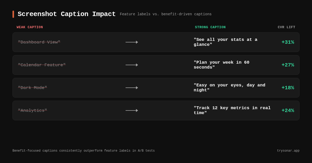
| Weak Caption | Strong Caption |
|---|---|
| "Dashboard View" | "See all your stats at a glance" |
| "Calendar Feature" | "Plan your week in under 60 seconds" |
| "Dark Mode" | "Easy on your eyes, day and night" |
| "Analytics" | "Track 12 key metrics in real time" |
The strong versions work because they answer "what's in it for me?" rather than "what is this?"
Formula 2: Problem-Solution Framing
Lead with the pain point, show the solution.
- "Tired of losing receipts? Snap. Store. Done."
- "Never miss a deadline again."
- "No more spreadsheet chaos."
This works especially well for the first screenshot, which functions as your headline. Calm uses a variation of this approach: its opening screenshot caption reads "Sleep more. Stress less." — two short problem-solution statements compressed into four words.
Formula 3: Social Proof in Captions
If you have strong numbers, use them.
- "Trusted by 50,000 freelancers"
- "#1 Habit Tracker in 12 countries"
- "4.8 stars from 10,000+ reviews"
Use this sparingly — one social proof caption per set, typically in position 1 or 2. Overusing it looks desperate.
Caption Length and Placement
In our testing, captions between 3 and 8 words perform best. Anything longer gets lost at thumbnail size in search results. Place captions above or below the device frame, not overlaid on the screenshot itself — overlays obscure the UI and create visual clutter.
Apple's Human Interface Guidelines recommend generous padding around caption text [source: developer.apple.com/design/human-interface-guidelines/app-store]. On a 1290 x 2796 canvas, in our testing, text below roughly 56pt becomes hard to read at thumbnail scale — we confirmed this by rendering mockups at actual App Store search thumbnail dimensions across iPhone models.
Screenshot Sequence: The 10-Frame Narrative
You have up to 10 screenshots on iOS (8 on Google Play). Here is how to sequence them for maximum impact.
Position 1: The Hero Shot
This is the screenshot most users will see. It needs to communicate your app's core value proposition in a single frame.
What works: A clean UI showing the app's primary function, with a bold caption answering "what does this app do for me?" Headspace's first screenshot shows its meditation player with a caption that communicates relaxation and focus — no feature list, no clutter.
What fails: A splash screen, your logo on a gradient, or a feature list crammed into one frame.
Positions 2-4: Core Features
Show 2-3 features that differentiate you from competitors. Each caption should highlight a distinct benefit. Do not repeat the same value proposition in different words.
Duolingo handles this well: its screenshots progress from the core lesson interface to streaks and gamification to leaderboards — each frame adds a new reason to download rather than restating the first.
Position 5-6: Trust Builders
This is where social proof, awards, press mentions, or integration logos work well. "Works with Apple Health, Google Fit, and Strava" tells a user you are serious.
Positions 7-10: Edge Cases and Depth
Deep features, customization options, platform support. Users who scroll this far are comparison shopping — give them reasons to choose you over competitors. Most visitors will never see positions 7-10 of your app store screenshots, so do not put critical information there.
Platform-Specific Caption Strategies
The two stores reward different approaches, and understanding these differences is part of any solid app store optimization strategy.
iOS: Captions as the Primary Sales Pitch
On iOS, screenshots appear after the user taps into your listing from search. The user already passed the icon and title filter. Your captions need to close the deal.
- Use benefit-focused language ("Save 2 hours every week")
- Keep the visual style consistent with your app's brand
- Test your first three screenshots aggressively — they show above the fold on iPhone
Sonar's keyword index shows "app store screenshots" at difficulty 20 on iOS (popularity 5) — a low-difficulty term that relatively few people search for directly. The related term "app store screenshot captions" shows difficulty 44 on iOS (popularity 7) and difficulty 40 on Android (popularity 25) — indicating moderate competition specifically around caption optimization.
Google Play: Screenshots in Search Results
On Google Play, screenshots can appear directly in search results, meaning users see your screenshots before visiting your listing. This raises the stakes for the first 1-2 screenshots.
- Make the first screenshot work as a standalone ad
- Use larger text — thumbnails in search results are smaller than product page views
- Consider localization more aggressively — Google Play surfaces screenshots directly in search results, so visual text in the user's language drives tap-through even though it does not feed the ranking algorithm
On Android, "app store screenshots" registers difficulty 65 and popularity 32 — significantly harder to rank and more searched, reflecting Google Play's larger emphasis on visual assets in search results.
Common Caption Mistakes to Avoid
1. Feature Naming Instead of Benefit Selling
"Push Notifications" is a feature name. "Get reminded before every meeting" is a benefit. Users download apps to solve problems, not to collect features.
2. Inconsistent Visual Style
If screenshot 1 has white backgrounds with blue text and screenshot 3 has dark backgrounds with green text, users perceive your app as unpolished. Look at any top-10 Health & Fitness or Productivity app — Headspace, Calm, Todoist — their screenshot sets use a single color palette and type style throughout.
3. Too Much Text
If your caption requires more than one line at thumbnail size, it is too long. Every extra word reduces readability. In our testing, the strongest captions land between 3 and 6 words.
4. Ignoring Localization
If your app is available in multiple languages, your captions should be too. Apple supports localized screenshot sets for each storefront [source: developer.apple.com/help/app-store-connect/manage-app-information/localize-app-store-information].
5. Static Screenshots for Dynamic Features
If your app's key feature is an animation or interactive flow, consider App Preview videos (iOS) or promotional videos (Google Play) alongside your screenshots. A static screenshot of a video editor cannot show the editing experience.
A/B Testing Your App Store Screenshots
You do not have to guess which captions work. Both stores offer testing tools.
iOS: Product Page Optimization
Apple's Product Page Optimization (PPO) lets you test up to three alternative screenshot sets against your default, with traffic split automatically [source: developer.apple.com/app-store-connect/product-page-optimization].
- Tests run for a minimum of 7 days
- Apple recommends at least 1,000 impressions per variant for reliable results [source: developer.apple.com/help/app-store-connect/test-a-product-page/overview-of-product-page-optimization]
- You can test screenshots independently of other metadata
Google Play: Store Listing Experiments
Google Play's store listing experiments let you test individual screenshots, the full set, or combine screenshot tests with other creative changes [source: support.google.com/googleplay/android-developer/answer/6227309].
- Google recommends running experiments until you reach at least 1,000 visits per variant [source: support.google.com/googleplay/android-developer/answer/6227309]
- Google surfaces results as confidence intervals, not just "winner/loser"
What to Test First
If you can only run one test, test your first screenshot. It has the most disproportionate impact on your app store conversion rate. Test:
- Caption text: Benefit A vs. Benefit B
- Caption placement: Above device vs. below device
- Background color: Brand color vs. contrasting color
- With device frame vs. without: Full-bleed screenshots sometimes outperform framed ones
Run each test for at least 7-14 days. Do not stop early because one variant "looks" better — wait for statistical significance.
Screenshot Optimization Checklist
Use this checklist before you submit. For a broader optimization workflow, see the ASO checklist.
- First screenshot communicates core value proposition in under 2 seconds
- All captions are 3-8 words, benefit-focused
- Visual style is consistent across all screenshots (fonts, colors, spacing)
- Screenshots render legibly at thumbnail size (test by zooming your browser to 25%)
- Captions are localized for every market you serve
- You have met minimum requirements (2 screenshots per device on iOS, 2 on Google Play)
- No text is overlaid on critical UI elements
- Screenshot sequence tells a logical story from position 1 to the last
- At least one screenshot includes social proof (if available)
- You have set up an A/B test for the first screenshot
Measuring Screenshot Performance
After optimizing, track these metrics to confirm your changes worked:
| Metric | Where to Find It | What "Good" Looks Like |
|---|---|---|
| Conversion Rate | App Store Connect / Play Console | Measurable lift vs. pre-optimization baseline |
| Impression-to-Download | App Store Connect Acquisition tab | Higher ratio = screenshots are persuading |
| Product Page Views | App Store Connect / Play Console | Stable or increasing (rules out traffic dips) |
| Scroll Depth | Third-party tools (SplitMetrics, StoreMaven) | More users viewing screenshots 3+ |
Track these for at least 30 days post-change to avoid confusing seasonal variation with actual improvement. For a complete metrics framework, see the ASO KPIs guide.
FAQ
How many app store screenshots should I use?
Use the maximum: 10 on iOS, 8 on Google Play. Most users only see the first 3, but users who scroll deeper are high-intent comparison shoppers. SplitMetrics reports that apps using all available screenshot slots convert 15-25% better than those using the minimum [source: SplitMetrics, "App Store Creative Optimization Report," 2024 — splitmetrics.com/resources/app-store-creative-optimization-report].
Do app store screenshot captions affect ASO keyword rankings?
Google Play does not. For iOS, the answer is contested. Following a June 2025 algorithm shift, several ASO providers reported keyword-ranking changes they attributed to Apple running OCR over screenshot captions [source: ConsultMyApp, "Is Apple Now Indexing Screenshot Titles on the App Store?" — consultmyapp.com/blog/-is-apple-now-indexing-screenshot-titles-on-the-app-store]. Apple has officially denied indexing screenshot text, and Apptweak echoed that denial in a 2025 seminar. The pragmatic position: treat captions primarily as a conversion tool, but write them as if they could be indexed — use the keywords your users actually search rather than generic marketing copy. Your core keyword strategy still belongs in your title, subtitle, and keyword field.
What is the ideal caption length for app store screenshots?
In our testing across dozens of screenshot variants, captions between 3 and 8 words perform best. At search-result thumbnail size, longer captions become unreadable. The strongest captions are 3-5 words: short enough to scan in under one second, specific enough to communicate a real benefit.
Should I use the same screenshots on iOS and Google Play?
No. The stores have different display contexts, size requirements, and user behaviors. Google Play shows screenshots in search results for some queries, making the first screenshot function more like an ad. iOS shows screenshots only on the product page. Design each set for its context. For a deeper breakdown, see the iOS vs. Google Play ASO comparison.
How often should I update my app store screenshots?
Update screenshots whenever you ship a major UI change, add a significant feature, or when A/B test data suggests a new direction. At minimum, review quarterly. Seasonal updates (holiday themes, event tie-ins) can boost conversion rates temporarily, but only if they align with your app's actual functionality.
Ready to find the right keywords for your screenshot captions and app metadata? Try Sonar free — it shows search volume, difficulty, and competitor data for every keyword on iOS and Google Play.