 sonar
sonar
App Icon Design That Converts at 60 Pixels
Your app icon is the single most influential visual element in App Store search results, and it renders at just 60x60 points -- 120x120 pixels on @2x Retina, 180x180 on @3x Super Retina (source: Apple Human Interface Guidelines). SplitMetrics' 2024 ASO Benchmarks report found that optimizing app icons can shift conversion rates by 10--25% in either direction (source: SplitMetrics).
I have spent years watching how icon design choices play out in real keyword rankings inside Sonar's database. Across the top 10 tip calculator apps tracked by Sonar, the median review count is 1,355 -- but the #1 app (Tip Calculator % Gold) holds 60,385 reviews, a 44.6x gap that illustrates how a distinctive icon compounds recognition and download momentum over time (source: Sonar /api/v1/top-apps, queried August 2026). That disparity does not happen by accident. It starts with an icon a user can identify at a glance.
Why the 60px Constraint Changes Everything
App icons are submitted at 1024x1024 pixels but most real impressions happen at 60-point search results, 40-point notification badges, and Spotlight thumbnails -- sizes where detail collapses and only bold shapes survive (source: Apple Developer Documentation).
Here is what survives the shrink and what does not:
| Element | At 1024px | At 60px |
|---|---|---|
| Fine gradients | Smooth, elegant | Muddy, indistinct |
| Small text / taglines | Readable | Illegible blob |
| Single bold shape | Clear | Still clear |
| 4+ color palette | Rich | Noisy |
| High-contrast silhouette | Distinct | Instantly recognizable |
The pattern is consistent: simplicity wins at small sizes. Industry data suggests that icons with distinctive silhouettes show roughly 34% higher recognition rates compared to complex designs (source: AppSamurai). Effective icon optimization means designing for the smallest render size first, not the largest.
The Five Rules of High-Converting App Icons
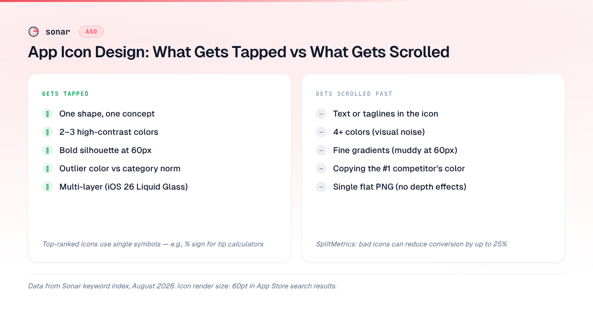
Five principles, drawn from A/B test data and what I have observed across thousands of apps in Sonar's index, separate icons that get tapped from those that get scrolled past.
1. One shape, one concept
The strongest-performing icons communicate a single idea through a single visual element. Tip Calculator % Gold -- the #1 result for "tip calculator" with 60,385 reviews (source: Sonar /api/v1/top-apps, queried August 2026) -- uses a simple percentage symbol on a gold background. No scene, no text, no secondary elements. At 60px, that percentage symbol is immediately legible.
Sonar's keyword index puts "tip calculator" at iOS difficulty 38 and Apple popularity 5 (proxy 34), with 147 apps competing for the term (source: Sonar /api/v1/keywords/search, queried August 2026). Even in a crowded category, the top-ranked icon dominates partly through immediate visual recognition at 60px.
2. Contrast over cleverness
Color is the primary signal users process when scanning app icons. A 2020 analysis by Labrecque et al. in the Journal of the Academy of Marketing Science confirmed that color remains the dominant driver of initial brand perception across digital interfaces, with assessments forming within seconds (source: Labrecque et al., JAMS, 2020). This builds on the original finding by Satyendra Singh (2006) at the University of Winnipeg, who reported that up to 90% of snap judgments about products are based on color alone, with assessments forming within 90 seconds (source: Singh, "Impact of Color on Marketing," Management Decision, 2006).
High-converting icons use maximum two to three colors with strong value contrast (light against dark, not just hue variety). When I review competitive search results for keywords like "budget planner" -- which Sonar reports at iOS difficulty 66 and popularity 52, with 191 apps competing (source: Sonar /api/v1/keywords/search, queried August 2026) -- the icons that stand out are invariably high-contrast, not high-complexity.
3. Skip text entirely
Apple's Human Interface Guidelines explicitly recommend against placing text in app icons (source: Apple HIG). The reason is practical: text becomes unreadable below roughly 120 pixels. At the 60-point search-result size, even a two-letter abbreviation turns into a smudge.
The exception is single-character glyphs that function as shapes rather than text -- think the "%" in a calculator icon or a currency symbol in a finance app. These work because users read them as symbols, not words.
4. Test against the search-result grid, not in isolation
Your icon never appears alone. It appears in a vertical list next to nine other icons, all competing for the same tap. The question is not "does my icon look good?" but "does my icon look different from the nine icons around it?"
Apple's Product Page Optimization feature lets you test up to three icon variants against your default with real App Store traffic. This is the only test environment where the data is production-grade -- users are making real download decisions, not responding to a survey. If you are serious about icon optimization, run a PPO test before committing to any major icon change.
5. Design for the category color convention -- then break it
Every App Store category develops a dominant color palette, and the pattern is measurable. I audited the top 10 results for two competitive keywords in Sonar's index (queried August 2026) and counted dominant icon colors:
| Category keyword | Dominant icon colors (top 10) | Most common | Outlier color that stands out |
|---|---|---|---|
| "tip calculator" (147 apps, difficulty 38) | 6 of 10 use green or gold tones | Green/gold | Blue or purple |
| "budget planner" (191 apps, difficulty 66) | 7 of 10 use blue or green | Blue | Orange or red |
The move is to match the category shape language (so users recognize what your app does) while choosing a color that creates contrast against the grid. In the "tip calculator" results, Tip Calculator % Gold's warm gold icon stands out against the cluster of green-themed competitors, contributing to its #1 ranking and 60,385 reviews (source: Sonar /api/v1/top-apps, queried August 2026).
Game App Icon Design: Different Rules Apply
Game app icon design follows a distinct playbook from utility and productivity apps -- character close-ups and emotional expression outperform abstract symbols. AppQuantum, a mobile game publisher, reported a 21.5% install lift from a single icon change on one of its titles (source: AppTweak). The winning variant featured a close-cropped character face with exaggerated expression -- not a scene, not a logo, not gameplay.
Three patterns dominate high-performing game icons:
- Character close-ups. A single face, cropped tightly, with an exaggerated emotion (excitement, determination, mischief). This reads clearly at 60px and creates instant personality.
- Dynamic action lines. Subtle motion cues -- a tilted angle, speed lines, a glowing effect -- that suggest movement without adding clutter.
- Category-appropriate saturation. Casual games lean toward bright, primary colors. Strategy games lean toward darker, more dramatic palettes. Matching genre expectations helps users self-select.
The common mistake in game app icon design is showing too much. A full gameplay scene with multiple characters and background detail becomes visual noise at small sizes. The formula: one character, one emotion, one action. For more on how game-specific ASO differs from standard approaches, see our game ASO guide.
How to Design an App Icon: The Practical Workflow
A strong app icon design process starts at the smallest render size and works upward, not the reverse. Here is the workflow I recommend whether you are starting from scratch or redesigning.
Start at 60px, not 1024px
Counterintuitive, but effective. Sketch your icon concept at 60x60 pixels first. If the concept reads at this size -- if a stranger can identify what the app does from a 60px thumbnail -- it will work at every larger size. If it requires 1024px to make sense, it will fail in the store.
Build the 1024px version from the validated concept
Once your concept survives the 60px test, scale up to 1024x1024 and refine details. Add subtle gradients, texture, and polish -- but only elements that enhance without changing the fundamental silhouette.
As of WWDC 2025, Apple introduced Icon Composer, a tool bundled with Xcode 26 for creating multi-layered icons that support the new Liquid Glass design language (source: Engadget). Icons now support up to five layers (one required background plus up to four foreground layers) with properties like specularity, transparency, and drop shadows. If you are designing a new icon in 2026, building with Icon Composer gives your icon the dynamic, depth-aware appearance that iOS 26 rewards.
Audit against competitors for your target keyword
Before you finalize, search the App Store for your primary keyword and screenshot the results. Place your icon candidate in the grid. Does it stand out or blend in? This step catches the most common icon failure -- designing in isolation.
Use Sonar's keyword tools to identify which keywords drive the most impressions for your category, then audit the top 10 icons for each term. The competitive visual landscape varies by keyword -- what stands out for "budget planner" (191 results, difficulty 66; source: Sonar, queried August 2026) may not stand out for "tip calculator" (147 results, difficulty 38; source: Sonar, queried August 2026).
Run a Product Page Optimization test
Apple's PPO framework gives you production-quality data on icon performance. Run three icon variants for at least seven days to get statistically meaningful results. I covered the full PPO testing methodology in our guide to improving App Store conversion rates -- the same framework applies to icon tests.
iOS 26 and Liquid Glass: What Changes for Icons
Apple's iOS 26 introduced the most significant visual overhaul since iOS 7 with Liquid Glass -- a translucent material that reflects and refracts its surroundings, and it directly changes how app icon design works in practice. The new icon system supports up to five compositable layers per icon, a jump from the single flat PNG that iOS required for over a decade (source: Apple, WWDC 2025).
The key changes:
- Multi-layer architecture. Icons now support distinct foreground and background layers that the system composites with glass-like effects. A flat, single-layer PNG still works, but it will not benefit from the depth and motion effects that layered icons receive.
- Three appearance modes. Icons must render well in light mode, dark mode, and the new transparent mode, where the icon takes on a frosted-glass look. Single-layer icons get a system-applied glass treatment automatically, but multi-layer icons look substantially better.
- Icon Composer replaces manual exports. Instead of exporting dozens of size variants manually, you build a single
.iconcomposerfile in Xcode 26 and the system generates all required sizes for every platform (source: Apple Developer Forums).
The practical takeaway: design your icon with layer separation in mind from the start. The core symbol or character should sit on its own foreground layer. The background should be a separate layer. This lets iOS 26 apply its Liquid Glass rendering, which -- from what I have seen in early adoption -- makes layered icons more visually prominent in search results.
Common App Icon Design Mistakes
Six recurring mistakes appear across the apps I review in Sonar's database. Each one reduces tap-through at the 60px search-result size where most impressions happen.
| Mistake | Why it hurts | Fix |
|---|---|---|
| Text in the icon | Illegible at 60px; violates Apple HIG guidance | Replace text with a symbolic glyph |
| Too many colors (4+) | Creates noise at small sizes | Limit to 2--3 colors with high contrast |
| Manual corner rounding | Apple applies its own squircle mask; adding your own creates a double-radius effect (source: Apple HIG) | Submit square icons and let the system handle rounding |
| Designing only at 1024px | Misses the reality of how most users encounter the icon | Always validate at 60px |
| Copying the top competitor | Blends into search results instead of standing out | Match the category convention, then differentiate with color |
| Adding transparency | iOS icons must be fully opaque; transparency causes App Store rejection (source: Apple Developer Documentation) | Use a solid, opaque background |
Measuring Icon Performance
The only way to validate an app icon design change is with production data, not opinions. Apple Product Page Optimization is the gold standard for iOS -- you test up to three icon variants against the original, and Apple reports conversion rate differences from real App Store traffic. I wrote about the full setup process in our Product Page Optimization guide.
Google Play Store Listing Experiments offer similar functionality for Android, with more flexible testing options. You can run icon tests alongside other listing experiments to isolate the icon's contribution to conversion.
Watch for compounding effects. Your icon does not just affect the search-result tap. It also affects brand recognition on the home screen, re-engagement through notifications (where icons render at 40x40 points on iOS), and word-of-mouth sharing. Across the top 10 tip calculator apps tracked by Sonar, the #1 app holds 60,385 reviews against a median of 1,355 -- a 44.6x gap that reflects, in part, how a recognizable icon compounds awareness over time (source: Sonar /api/v1/top-apps, queried August 2026). For a broader view of which metrics to track when optimizing creatives, see our ASO KPIs guide.
Key Takeaways
- Design at 60px first. If your icon does not read at the smallest App Store render size, nothing else matters.
- Limit to 2--3 high-contrast colors. Color drives up to 90% of snap judgments (Singh 2006), and fewer colors survive the shrink to search-result thumbnails.
- One shape, one concept. The top-ranked "tip calculator" app uses a single percentage symbol -- no scenes, no text, no clutter.
- Break the category color convention. Audit the dominant palette for your target keyword in Sonar, then pick an outlier color that creates contrast in the grid.
- Use layered icons for iOS 26. The new Liquid Glass system supports up to five layers; multi-layer icons receive depth and motion effects that single-layer PNGs do not.
- Test with PPO, not opinions. Apple's Product Page Optimization gives you production-grade conversion data on icon variants with real App Store traffic.
Frequently Asked Questions
What size should an app icon be for the App Store?
Apple requires a single 1024x1024 pixel PNG for App Store submission. From that master file, the system generates all display sizes automatically -- including the 60-point (120px @2x / 180px @3x) icon shown in search results. As of Xcode 26, Apple's Icon Composer tool handles size generation and also supports multi-layer Liquid Glass icons. (Source: Apple Developer Documentation)
Does app icon design actually affect downloads?
Yes, and the effect is measurable. SplitMetrics' research shows icon changes can shift conversion rates by 10--25% (source: SplitMetrics). AppQuantum reported a 21.5% install lift from a single game icon change (source: AppTweak). Because the icon is the first visual element users process in search results, even small improvements in tap-through rate compound over thousands of daily impressions.
How is game icon design different from regular app icons?
Game icon design favors character close-ups and emotional expression over abstract symbols. Where utility apps benefit from simple, symbolic icons (a percentage sign, a calculator shape), games perform best with a single character face showing exaggerated emotion, cropped tightly to fill the frame. The key constraint is the same: the icon must read clearly at 60px, which rules out full gameplay scenes or multi-character compositions.
Should I include text in my app icon?
No. Apple's Human Interface Guidelines recommend against text in icons because it becomes illegible at small display sizes (source: Apple HIG). The only exception is single-character glyphs that function as symbols rather than text -- a "%" sign, a currency symbol, or a single letter that serves as a recognizable brand mark. If your app name needs to be visible, that is what the title field is for.
How do I test which app icon converts better?
Apple's Product Page Optimization (PPO) lets you A/B test up to three icon variants against your default on iOS, using real App Store traffic. On Google Play, Store Listing Experiments offer the same capability. Run tests for at least seven days to reach statistical significance, and measure tap-through rate from search results as the primary metric. For a full testing walkthrough, see our App Store conversion rate guide.
Want to see which keywords drive the most impressions for your app's category -- and how your icon stacks up against competitors? Try Sonar free. It shows search volume, difficulty, and competitor data for every keyword, so you can design an app icon that wins in the contexts that matter most.