 sonar
sonar
The Google Play feature graphic is a 1024×500 banner you can't publish without
The Google Play feature graphic is a 1024px by 500px image, JPEG or 24-bit PNG with no alpha channel, and Google states plainly: "You must provide a feature graphic to publish your store listing" source: support.google.com/googleplay/android-developer/answer/9866151. It's the one asset every Android developer has to make and most make in ten minutes the night before launch.
That's a mistake, and the reason is where the banner shows up. Google uses the feature graphic as the cover of your preview video and in large-format collections, the placements where someone who has never heard of your app decides whether to tap. When I checked the US Google results for "google play feature graphic" on September 25, 2026, the top ten were Google's own help page, a Stack Overflow thread from 2011, agency posts from 2017 and 2023, a glossary, and two generator tools. None of them is a current, practical guide for a solo developer. This is my attempt at one.
This post covers the Google Play feature graphic only. For screenshot dimensions on both stores, see the App Store and Google Play screenshot sizes guide. I won't repeat them here.
By Peter. Google Play Console Help checked September 25, 2026. Keyword data from Sonar's API, US storefront, pulled the same day.
Feature graphic specs: size, format and the hard requirements
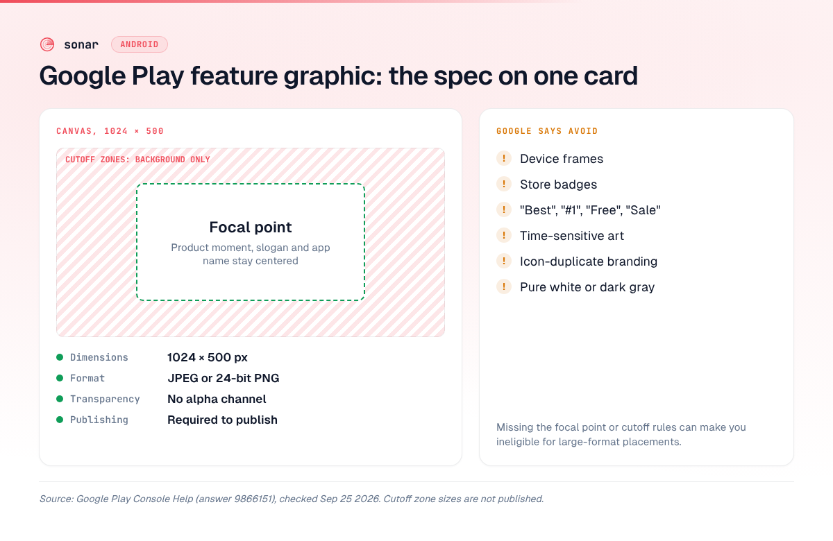
Google lists exactly two technical requirements for the feature graphic: the file must be "JPEG or 24-bit PNG (no alpha)" and the dimensions must be "1024px by 500px" source: support.google.com/googleplay/android-developer/answer/9866151. Everything else on that page falls under "Highly recommended".
That split matters. Google says the requirements "are mandatory; failure to meet requirements may result in removal or suspension," while the recommended guidelines "can help make your app or game more eligible for recommendation and promotion throughout Google Play" (same source). Break a recommendation and your listing still publishes. You just give up some featuring.
| Spec | Value | Status |
|---|---|---|
| Dimensions | 1024 × 500 px | Required |
| Format | JPEG or 24-bit PNG | Required |
| Transparency | No alpha channel | Required |
| Alt text | 140 characters or less | Highly recommended |
| Focal point | Toward the center | Highly recommended |
| Maximum file size | Not documented for the feature graphic | — |
Two practical notes. First, "no alpha" catches people who export from Figma with a transparent background. Flatten it onto a solid color before uploading. Second, Google documents a 1024KB maximum for the 512×512 app icon but gives no file size limit for the feature graphic on the same page source: support.google.com/googleplay/android-developer/answer/9866151. I'd still export a compressed JPEG unless you need PNG's crisp edges for text.
Cutoff zones and the safe area
Google tells you to "keep prominent visuals and the focal point towards the center of the graphic" and to avoid placing "brand logo, app name, primary slogan, and main UI" in the cutoff zones, because they "may be cut off depending on the UI format" source: support.google.com/googleplay/android-developer/answer/9866151.
What Google does not publish is the size of those zones. The help page shows them as red areas on an example diagram, with no pixel values in the text. Anyone quoting an exact "safe area" in pixels is either measuring that diagram or guessing. Google also warns that "some formats may use additional UI overlays", which means the crop isn't the only thing covering your edges.
The penalty is spelled out: "Failure to comply with the focal point and cutoff zones may result in ineligibility to appear in these formats" (same source). So the safe zone decides whether you get featured, not just whether the banner looks tidy.
My working rule, without pretending it's a Google number:
- Put the one thing that must be seen (the product moment, the main character, the slogan) in the middle of the canvas.
- Treat all four edges as bleed. Google's own phrasing is "restrict background elements to the edges of the graphic."
- Assume a play button may sit on top of the center when you have a video (more on that below), so don't put small text exactly in the middle either.
What Google tells you to avoid
Google's "highly recommended" feature graphic guidelines tell you to avoid five kinds of content: performance or promo claims, time-sensitive content, third-party trademarks, device imagery, and store badges source: support.google.com/googleplay/android-developer/answer/9866151. The exact list:
| Avoid | Google's wording or example |
|---|---|
| Performance and promo claims | "Best," "#1," "Top," "New," "Free," "Discount," "Sale," or "Million Downloads" |
| Testimonials and awards | "user testimonials, accolades or awards" |
| Time-sensitive content | Content "that can become outdated quickly"; holiday art "should be swapped in and out in a timely manner" |
| Third-party trademarks | "Third-party trademarked characters or logos without proper permission" |
| Device imagery | Can "become obsolete quickly or alienate some users" |
| Store badges | "Google Play or any other store's badge or icon" |
| Icon duplication | "Do not use prominent branding that is similar to your app icon" |
| Fine detail | "These will not be visible on many phone screens" |
| Pure white or dark gray | These "can easily blend in with Google Play's background" |
The device-imagery rule is the easiest to break by accident, because most screenshot templates ship with phone frames. On a 500px-tall banner, a frame shrinks your actual UI and pushes it toward the edges. The color rule is the one nobody reads: a white banner on a white Play Store background has no edge at all.
Google also asks you to "localize your graphic and branding text as appropriate for different markets and languages" and to add alt text of "140 characters or less", skipping "photo of" or "image of" because screen readers already announce that (same source).
Where the feature graphic appears on Google Play in 2026
According to Google, the feature graphic shows in three places: as the cover image of your preview video, in large-format app collections "including ads", and in large-format groups of recommended games source: support.google.com/googleplay/android-developer/answer/9866151. Google says it's used "in various places on Google Play, including" these, so the list isn't necessarily complete.
As your preview video's cover
If you've added a YouTube preview video, it's "displayed before your screenshots on your app's store listing," and "users can watch your preview video by tapping on the play button that overlays on your feature graphic" (same source). Google adds that the video "may autoplay inline with muted audio up to 30 seconds depending on the user device, setting, network connection, and surface area," and that "whenever your video does not autoplay, a play button is overlaid on your feature graphic." The feature graphic is effectively your video thumbnail. Design it to invite the tap, and leave the dead center free of anything the play button would cover. (Spatial Android XR videos are the exception: they use the YouTube thumbnail instead.)
In large-format collections and game recommendations
For apps, Google shows "a collection of apps in a large format with your feature graphic, including ads." For games, "groups of recommended games in a large format featuring preview videos and screenshots, where we show your feature graphic" (same source). These are browse surfaces. Your banner sits next to other apps' banners, which is why contrast and a single focal point matter more than detail.
What Google doesn't document
Google's help page doesn't say whether the feature graphic appears on your listing page when you have no preview video, and it doesn't say the graphic appears in keyword search results. I won't claim either. Google does say your preview video "may also be displayed on both home and search page," but that's the video, not the banner (same source). There's also no documented link between the feature graphic and search ranking.
Why the feature graphic matters more when a keyword is hard
A keyword gets you into the results. The listing assets are what convert that view into an install. Take "habit tracker" on Google Play US: Sonar scores it difficulty 62 with a popularity estimate of 55 (Sonar's Android estimate), across 30 analyzed results (source: Sonar keyword API, US storefront, queried 2026-09-25). On the iOS App Store the same term scores difficulty 67 and Apple Search Popularity 57 (same source).
The difficulty breakdown marks the Android term as beatable, with a weak spot at rank 3. But look at who you're up against. The top Play result is Loop Habit Tracker, rated 4.72 with 63,330 reviews, followed by HabitNow, Habitica, Disciplined and HabitKit (source: Sonar /api/v1/apps/search, Google Play US, queried 2026-09-25). A new app that climbs into that list still has to beat those listings on the second the user spends looking. You can't fake tens of thousands of reviews overnight. You can ship better visuals.
This is the Android side of the conversion story I cover for screenshots in how to make App Store screenshots that convert. The feature graphic sits above the screenshots when you have a video, so it's the first frame of that story.
Feature graphic design patterns by category
The strongest feature graphics show one idea with one focal point: the product in use, the promise in a few words, or the game's world. Below are patterns I'd start from. They're patterns, not descriptions of specific apps' current graphics, and each one follows the Google rules above.
| Category | Pattern | Focal point | Watch out for |
|---|---|---|---|
| Productivity and habits | One enlarged UI element (a streak, a chart, a checked list) on a saturated background, plus a short promise | The UI crop, centered | Tiny UI text, phone frames |
| Finance | A single result state ("the transaction complete screen" is Google's own alt-text example) with calm, high-contrast color | The number or state | Price or "Free" claims, bank logos you don't own |
| Health and fitness | A person or illustrated figure mid-activity, one short benefit line | The figure | Before/after claims that read as testimonials |
| Games | Key art from the actual game world, character in the middle, logo off-center but inside the safe area | The character or action moment | Pre-rendered art that doesn't match gameplay, "#1" ribbons |
| Utilities | A bold visual metaphor (a cleaned storage bar, a scanned document) with minimal copy | The metaphor | Stock icons that duplicate your app icon |
| Kids and education | Bright illustration with one character and one learning moment | The character | Licensed characters without permission |
A few rules cut across categories:
- One message. If a stranger can't say what the app does after one glance, the banner is too busy. Google's warning about fine details that "will not be visible on many phone screens" applies here.
- Extend the icon, don't repeat it. Google asks for "a similar or complementary color theme" across graphic, icon and app, while avoiding "prominent branding that is similar to your app icon." Same palette, different image.
- Games lean on video. Google calls a preview video "not required" but says "your game requires a preview video to be shown in certain parts of Google Play" source: support.google.com/googleplay/android-developer/answer/9866151. For a game, the feature graphic and the video are one unit.
A practical checklist before you upload
Every feature graphic should pass these checks before you upload it. Each maps to a Google requirement or recommendation source: support.google.com/googleplay/android-developer/answer/9866151:
- Exported at exactly 1024 × 500, JPEG or 24-bit PNG, alpha flattened.
- Focal point and any text in the center; edges carry only background.
- Center still readable with a play button on top (if you have a video).
- Background isn't pure white or dark gray.
- No "Best", "#1", "Top", "New", "Free", "Sale", ratings, awards or download counts.
- No device frames, store badges or third-party logos.
- Doesn't duplicate your icon; shares its palette.
- Nothing seasonal unless you have a date on the calendar to swap it out.
- Localized versions for your main non-English markets.
- Alt text written, 140 characters or less, no "image of".
- Viewed at phone size on a real device, not only on a 27-inch monitor.
Test it: experiments and custom store listings
You can A/B test the feature graphic in Play Console. Google's store listing experiments support default graphics experiments that "include variants of your app's icon, feature graphic, and screenshots," with up to two variants per experiment, and localized experiments in up to five languages source: support.google.com/googleplay/android-developer/answer/6227309.
One catch from the same page: if you've uploaded a localized feature graphic in a language, users viewing your listing in that language are excluded from your default graphics experiment, "even if you're testing your icon." Localize after you've settled the default, or run a localized experiment for that market.
Custom store listings go further. You can create "up to 50 custom store listing pages" and customize "your app's name, icon, descriptions, and graphic assets" per audience, including by country, pre-registration status, or users who find your app through specific search terms source: support.google.com/googleplay/android-developer/answer/9867158. I've written up what's worth testing first in Play Store listing experiments: what to test.
FAQ
What size is the Google Play feature graphic?
The Google Play feature graphic is 1024px wide by 500px tall. It must be a JPEG or a 24-bit PNG with no alpha channel source: support.google.com/googleplay/android-developer/answer/9866151. Google doesn't publish a file size limit for it.
Is a feature graphic required?
Yes. Google's Play Console Help says "You must provide a feature graphic to publish your store listing" source: support.google.com/googleplay/android-developer/answer/9866151. You also need an app icon, a short description and at least two screenshots to publish.
Can I put text on a feature graphic?
Yes, Google's guidelines mention an app name and "primary slogan" as elements to keep out of the cutoff zones, so short text is expected. Keep it to a few words, keep it centered, and localize it per market. Don't use claims like "Best", "#1", "Free" or "Sale" (same source).
Where does the feature graphic show up?
Google documents three placements: the cover of your preview video, large-format app collections including ads, and large-format recommended-game groups source: support.google.com/googleplay/android-developer/answer/9866151. Google doesn't document whether it shows on your listing page without a video.
Can I A/B test my feature graphic?
Yes. Play Console store listing experiments can test the feature graphic in default graphics experiments and in localized experiments, with up to two variants per experiment source: support.google.com/googleplay/android-developer/answer/6227309.
Want to know which keywords get your listing seen in the first place? Try Sonar free — track your Google Play and App Store rankings, see keyword difficulty and popularity, and find out where your visuals have to do the heavy lifting.