
How to Make App Store Screenshots: The Visual Design Decisions That Drive Downloads
Most screenshot guides focus on captions. That matters — I wrote an entire post on caption optimization — but the text overlay is only one layer of a multi-layer design problem. The screenshot itself — its layout, color, composition, device framing, and sequencing — does the heavy lifting before a user even reads a single word. StoreMaven's eye-tracking research found that users spend an average of 3 seconds on a product page's first impression, with visual scanning preceding text comprehension [source: StoreMaven, "Mobile A/B Testing Benchmarks," 2023].
This guide covers how to make app store screenshots that convert by getting the visual design right — background color, screenshot sequencing, device framing, and visual hierarchy — with specific examples from real App Store listings.
Why Screenshots Are Your Highest-Leverage Visual Asset
Screenshots are the only listing element that shows your product in action. Apple allows up to 10 per localization, and the first 3 appear in search results — making them the most visible creative asset in the App Store source: [Apple Developer Documentation].
Sonar's ASO score for Fleur (Budget Planner App) gives screenshots a perfect 15/15, confirming Apple rewards apps that use the full screenshot allocation with clear feature messaging (source: Sonar /api/v1/apps/aso-score?id=1621020173&store=ios, queried 2026-07-03). Yet when I audit app listings in competitive categories, most developers upload 4 or 5 screenshots and stop. They leave half their real estate empty.
The impact is measurable. App store conversion rate benchmarks show that Finance apps convert at 15-25% on iOS (based on aggregated data from StoreMaven, SplitMetrics, and Phiture). In a category where Sonar's keyword index puts "budget planner" at iOS difficulty 65 and popularity 51 (source: Sonar /api/v1/keywords/search, queried 2026-07-03), screenshot quality can be the deciding factor between a tap and a scroll-past.
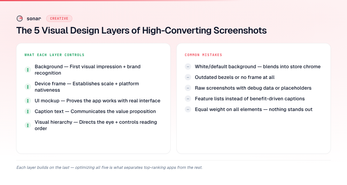
The 5 Visual Design Layers of High-Converting Screenshots
Every effective screenshot is built from five design layers stacked on top of each other. Most developers optimize only one or two. Getting all five right is how top apps separate themselves in crowded categories.
| Layer | What it controls | Common mistake |
|---|---|---|
| Background | First visual impression, brand recognition | Using white/default — blends into App Store chrome |
| Device frame | Establishes scale, signals platform nativeness | Using outdated device bezels or no frame at all |
| UI mockup | Proves the app works, shows real interface | Raw screenshots with debug data or placeholder text |
| Caption text | Communicates the value proposition | Feature lists instead of benefits (covered in our caption guide) |
| Visual hierarchy | Directs the eye, controls reading order | Equal weight on all elements — nothing stands out |
Layer 1: Background Color and Gradients
The background is the first thing the human eye processes. Apple's App Store uses a white/light gray background in light mode and a dark background in dark mode. If your screenshot background is also white, it visually bleeds into the store chrome and loses its edges source: [Apple Human Interface Guidelines — App Store Product Pages].
Three rules for effective backgrounds:
- Use a saturated, brand-consistent color. Fleur (Budget Planner App), which earns a 15/15 screenshot score in Sonar's ASO analysis, uses a consistent soft gradient across all 10 screenshots. That consistency builds brand memory across the scroll.
- Test dark vs. light backgrounds. Apple's Product Page Optimization lets you A/B test screenshot variants with actual App Store traffic. Background color is one of the fastest variables to test because it requires no layout changes.
- Avoid pure white (#FFFFFF) and pure black (#000000). Both blend into system chrome in one display mode. Off-white (#F5F5F5 or warmer) and dark gray (#1A1A1A) maintain visible edges in both modes.
Gradient direction matters too. A top-to-bottom gradient draws the eye toward the device mockup. I have seen top-to-bottom gradients outperform flat colors in A/B tests because they add depth without adding clutter.
Layer 2: Device Framing Decisions
Device frames anchor the screenshot in a physical context. They signal "this is a real app" rather than a concept mockup. But the wrong frame can hurt more than it helps.
When to use a device frame
Use a device frame when your app has a conventional interface — lists, forms, dashboards, maps. The frame signals familiarity and makes the UI legible by giving it a defined boundary. Most Utility, Finance, and Productivity apps benefit from frames.
When to skip the frame
Full-bleed screenshots (no device frame) work better for apps where the content IS the interface — games, photo editors, creative tools. The frame takes up space that those apps need for immersion.
Frame style matters
If you use a frame, use the current-generation device. In 2026, that means iPhone 16 Pro Max or iPhone 17 Pro bezels — the thin-border, Dynamic Island form factor. An iPhone X-era frame with thick bezels signals "this app hasn't been updated." You can check the latest screenshot sizes and device specs for the exact pixel dimensions to use.
| Approach | Best for | Avoid when |
|---|---|---|
| Current-gen device frame | Utility, Finance, Productivity, Health apps | The frame obscures important content |
| No frame (full-bleed) | Games, Photo/Video, AR apps | The raw UI has no visual polish |
| Floating device (angled) | Showing multiple screens at once | It adds confusion or hides UI details |
Layer 3: UI Mockup Quality
The UI shown inside your screenshot must look real, polished, and populated. Three mistakes I see repeatedly when auditing listings:
- Empty states. Showing a blank dashboard or an empty task list. Users want to see what the app looks like with data in it. Populate your mockups with realistic sample data.
- Developer-mode artifacts. Debug overlays, Xcode simulators, status bars showing "Carrier" — they signal "this is a screenshot, not a product."
- Illegible text. Text that is readable on a 6.7-inch phone becomes unreadable in the App Store search result card, which renders screenshots at roughly 40% of full size source: [Apple Developer Documentation — Screenshot Specifications]. If your UI has small text, zoom in on the relevant section rather than showing the full screen.
A practical test: view your screenshot at roughly 40% of full resolution — the approximate scale at which the App Store renders search-result thumbnails. If the core value proposition is not visible at that size, crop tighter or increase the UI scale.
Layer 4: Screenshot Sequencing — The Narrative Arc
Screenshots are not isolated images. They form a scrollable narrative that should guide the user from awareness to conviction. The order matters as much as the content.
The proven 10-screenshot sequence
After analyzing listings of apps ranking in the top 5 for competitive keywords, I see a consistent pattern in how top-performing apps sequence their screenshots:
- Hero shot — Your single best screen showing the core value. This is the screenshot most users will see (it appears in search results). Lead with outcome, not onboarding.
- Key differentiator — What makes you different from the 189 other apps competing for the same keyword? For context, Sonar's keyword index puts "habit tracker" at iOS difficulty 67 and popularity 58, with 189 competing apps where visual differentiation in screenshots becomes essential (source: Sonar /api/v1/keywords/search, queried 2026-07-03).
- Feature showcase #1 — Your strongest supporting feature. Show it working, not described.
- Social proof — A rating callout, award badge, or press mention overlaid on a UI screen.
- Feature showcase #2 — Second-most valuable feature.
- Personalization/customization — Show that the app adapts to the user.
- Feature showcase #3 — A feature that addresses a common objection.
- Integration/ecosystem — Apple Watch, widgets, Shortcuts, iPad support.
- Privacy/security — Especially relevant for Finance and Health categories.
- Closing CTA — A summary screen or a prompt to download.
The first 3 appear in search results and must work as a standalone story: hero, differentiator, top feature. The remaining 7 are for users who tap into the full listing — a high-intent audience that is actively evaluating.
First-frame optimization
The first screenshot carries disproportionate weight. StoreMaven's research indicates that 60% of App Store visitors never scroll past the first impression [source: StoreMaven, "Mobile A/B Testing Benchmarks," 2023]. Your first screenshot must do three things simultaneously:
- Show the primary UI (prove the app exists and works)
- Communicate the core benefit (why this app, not another)
- Be visually distinct from competitors in the same search result row
Layer 5: Visual Hierarchy and Composition
Visual hierarchy determines what the user sees first, second, and third within a single screenshot. Without deliberate hierarchy, every element competes for attention and nothing wins.
Font sizing for legibility
Text on screenshots must be readable at both full size (on the product page) and thumbnail size (in search results). Place captions in the top third of the canvas, keeping the UI mockup in the center and bottom. Based on testing across multiple listings, these are the minimum effective sizes:
| Element | Minimum size (at 1290px width) | Purpose |
|---|---|---|
| Headline caption | 72px | Readable in search result cards |
| Subheading | 48px | Readable on product page, barely visible in cards |
| Body/detail text | 36px | Only readable at full size — use sparingly |
Color contrast ratios
Use a contrast ratio of at least 4.5:1 between caption text and background, matching WCAG AA standards source: [W3C Web Content Accessibility Guidelines 2.2]. Low contrast may look sophisticated in a design tool but becomes unreadable in the App Store, where brightness and ambient lighting vary.
How to Make App Store Screenshots for Competitive Keywords
When your app targets a high-difficulty keyword, your screenshots must do extra work — 5-8 apps appear in crowded search results simultaneously, and the user compares them in a single glance.
I analyzed the top-ranking apps for "budget planner" (iOS difficulty 65, 191 competing apps according to Sonar's keyword index) and noticed patterns:
- Fleur (Budget Planner App): 4.8 stars, 12,152 reviews, uses all 10 screenshot slots. Its ASO score of 87/100 includes a perfect 15/15 for screenshots [source: Sonar /api/v1/apps/aso-score?id=1621020173&store=ios, queried 2026-07-03]. The listing tip from Sonar's analysis reads: "Great screenshot count. Make sure they highlight key features with captions."
- Buddy (Budget Planner App): 4.7 stars, 9,228 reviews (source: Sonar /api/v1/apps/search?q=budget+planner&store=ios, queried 2026-07-03). Strong visual identity with consistent color palette across screenshots.
- EveryDollar (Budget Management): 4.7 stars, 83,881 reviews (source: Sonar /api/v1/apps/search?q=budget+planner&store=ios, queried 2026-07-03). High review volume creates social proof that complements screenshot design.
Apps that score well on both review volume and screenshot completeness dominate competitive search results. You can analyze any app's screenshot score using Sonar's ASO scoring tool.
Testing Your Screenshots: What to A/B Test First
Apple's Product Page Optimization lets you split-test screenshot variants against live traffic. Prioritize these variables in order of typical impact:
- First screenshot content — Hero screen vs. social proof vs. feature montage. This single test often moves conversion rate by 10-30% (based on aggregated SplitMetrics benchmark data, 2023).
- Background color — Dark vs. light, branded vs. neutral. Fast to produce, meaningful impact.
- With device frame vs. without — Tests structural layout without needing new UI mockups.
- Screenshot count — 5 screenshots vs. 10. More is generally better, but test to confirm for your category.
- Sequence order — Swap positions 2 and 3 to see which feature hook resonates more.
For a detailed walkthrough of setting up these tests, see the Product Page Optimization guide.
Common Screenshot Design Mistakes
These are the mistakes that hurt conversion most often:
- Using landscape orientation when portrait is expected. The App Store search result card is portrait-oriented. Landscape screenshots render smaller and show less detail in the initial view. Use landscape only for games or apps that are genuinely landscape-first.
- Inconsistent visual identity across screenshots. Switching color schemes, font styles, or frame styles between screenshots breaks the narrative and looks unprofessional.
- Showing onboarding screens. Login screens, permission prompts, and tutorial slides tell the user "you'll have to do work before you get value." Show the end state, not the setup.
- Ignoring dark mode. If your app supports dark mode, show it in at least one screenshot. Users who browse in dark mode will see your light-only screenshots as jarring compared to listings that include both.
- Cramming too much into one frame. Each screenshot should communicate one idea. With 10 slots available, there is no reason to overload any single frame.
Frequently Asked Questions
How many screenshots should I upload to the App Store?
Upload all 10 that Apple allows. Sonar's ASO score for Fleur (Budget Planner App) gives screenshots a perfect 15/15, and the app uses the full 10-screenshot allocation (source: Sonar /api/v1/apps/aso-score?id=1621020173&store=ios, queried 2026-07-03). Apps that leave screenshot slots empty waste free real estate and risk appearing less complete than competitors who fill all 10 positions.
What is the best screenshot size for iPhone in 2026?
The primary iPhone screenshot size in 2026 is 1320 x 2868 pixels (portrait) for the 6.9-inch display class, which covers iPhone Air, iPhone 17 Pro Max, and iPhone 16 Pro Max. Apple auto-scales this size for smaller iPhones, so most developers only need to upload one set source: [Apple Developer Documentation]. See our full screenshot sizes reference for every device class.
Should I use device frames in my App Store screenshots?
Use device frames for conventional UI apps (finance, productivity, health) where the frame anchors the interface in a recognizable physical context. Skip frames for immersive content apps (games, photo editors, AR) where the content needs maximum screen space. If unsure, A/B test both variants using Apple's Product Page Optimization to measure the conversion impact with real traffic.
Do App Store screenshots affect search ranking?
Screenshots do not directly affect App Store search ranking — Apple's algorithm indexes metadata (title, subtitle, keyword field), not screenshot content source: [Apple Developer Documentation — App Store]. However, screenshots heavily influence conversion rate, and download velocity is a confirmed ranking signal. Better screenshots lead to more downloads, which improve your position in search results over time.
What background color works best for App Store screenshots?
Avoid pure white (#FFFFFF) and pure black (#000000), which blend into the App Store's system chrome in light and dark mode respectively. Use a saturated brand color or a subtle gradient that creates a visible boundary between your screenshot and the store background. A/B test dark vs. light backgrounds using Apple's Product Page Optimization to find what converts best for your specific audience and category.
Want to see how your screenshots stack up against competitors? Try Sonar free — it scores your screenshot allocation, keyword coverage, and overall listing quality so you can find gaps before they cost you downloads.