Most Indie Devs Never Audit Their Listings
You spent weeks building the app. You wrote a description, picked some screenshots, and hit publish. Then you moved on to the next feature. That listing you threw together in 20 minutes is now the single biggest factor in whether anyone finds your app — and you haven't looked at it since.
An app store listing audit takes 30 minutes and can meaningfully change your search rankings. Most developers never do one because they don't know what to look for. This guide fixes that.
What an ASO Audit Covers
A proper audit evaluates six areas of your listing, each contributing to how your app ranks in search results and how well it converts impressions into installs:
| Area | What It Affects |
|---|---|
| Title and subtitle | Search ranking (most weighted field) |
| Description | Conversion rate, Google Play search ranking |
| Visual assets | Conversion rate (screenshots, icon, preview video) |
| Ratings and reviews | Search ranking, conversion rate |
| Keyword coverage | Search visibility across relevant terms |
| Competitive positioning | Relative strength against top competitors |
A weakness in any one area drags down your overall listing performance. The goal of an audit is to find those weaknesses and prioritize fixes.
Title and Subtitle Optimization
What good looks like
A strong title uses the full 30-character limit with your brand name and your single best keyword. Flowstate - Focus Timer is good (check the focus timer keyword difficulty to see competition for that term) — it's branded, searchable, and immediately communicates what the app does. A strong subtitle adds a second keyword without repeating any words from the title: Pomodoro Technique & Deep Work.
What bad looks like
An app titled just Flowstate with no keyword is wasting its most valuable field. On the other end, Best Focus Timer Pomodoro Work Productivity App will get rejected by Apple and looks like spam to users.
Common mistakes
- Not using the full 30 characters in either field
- Repeating keywords between title and subtitle (Apple deduplicates, so you're wasting space)
- Changing the title too frequently (this can temporarily reset your ranking history)
Quick wins
Count your title characters right now. If you have room, add your primary keyword. This takes 2 minutes in App Store Connect or Google Play Console and is the highest-impact single change you can make. For detailed field-by-field strategy, see our metadata optimization guide.
Description Quality
iOS vs Google Play
On iOS, the description is not indexed for search. It exists purely to convert — to convince someone who landed on your page to tap "Get." On Google Play, the long description is indexed, making it function more like a web page from an SEO perspective.
What good looks like
A strong iOS description leads with the core value proposition in the first 2-3 lines (the only part visible before "more"). It lists features with clear benefit statements, not just feature names.
A strong Google Play description does the same thing but also weaves in target keywords naturally, 3-5 mentions of primary keywords across 4,000 characters.
What bad looks like
Opening with "Welcome to our amazing app!" tells the user nothing. Bullet-pointing 40 features with no explanation of benefits overwhelms instead of persuading. On Google Play, a 200-word description is leaving 3,800 characters of indexable space on the table.
Quick wins
Rewrite your first three lines. Those lines are visible without tapping "more" and determine whether 80% of viewers read further. Lead with the specific problem your app solves, not your brand story.
Visual Assets
Screenshots
Screenshots are the second-biggest conversion factor after ratings. Users scroll through them for about 3 seconds before deciding.
What good looks like: The first screenshot shows the core feature with a clear caption. Each subsequent screenshot highlights a different feature. The screenshots tell a story — problem, solution, result.
What bad looks like: Using raw Simulator screenshots with no captions or context. Showing a settings screen as your first screenshot. Having 10 screenshots that all look the same.
- Not testing how screenshots render at the small size shown in search results (not the full-screen listing view)
- Using landscape screenshots for an app people use in portrait — the previews look tiny in search
- Identical screenshots across iOS and Google Play despite different audience expectations
Icon
Your icon needs to work at 60x60 pixels on a phone screen, which means a single recognizable shape or symbol. If you need to squint to understand it, it's too complex.
Preview video
If you have one, it auto-plays on iOS in search results. A poor video (slow start, confusing UI, no clear value) actively hurts conversion. No video is better than a bad video. If you do make one, show the core feature in the first 3 seconds.
Quick wins
Look at your first screenshot at the size it actually appears in search results (about 1 inch wide). Can you tell what the app does? If not, redesign that one screenshot.
Ratings and Reviews Profile
Why this matters for rankings
Ratings directly affect your search rank position. Two apps with identical keyword relevance will be separated by their rating and review count. Below 4.0 stars, conversion drops sharply — users filter you out mentally before reading anything else.
Before and after: a real pattern
Consider a typical indie app sitting at 3.7 stars with 18 reviews, the most recent one a 1-star complaint about a crash from two months ago. No developer responses. The "current version" rating is 3.2 while "all versions" shows 4.1 — a clear regression signal.
After three changes — fixing the crash, responding to every negative review, and moving the review prompt to trigger after the third completed task instead of during onboarding — the same app hits 4.4 stars with 60 reviews within six weeks. The conversion rate from impression to install nearly doubles because users stop filtering it out at a glance.
The mistakes that created that 3.7
- Prompting for reviews during onboarding, before users experienced any value
- Ignoring negative reviews entirely (this is publicly visible and signals abandonment)
- Shipping a buggy update and triggering the review prompt in the same release, compounding negative ratings
The fix
If you're not using SKStoreReviewController (iOS) or the In-App Review API (Android), add it today. Trigger it after a positive moment — completing a task, hitting a streak, or the third session. This alone can move your rating by 0.2-0.3 stars within a month. Respond to every negative review with a short, genuine acknowledgment — even a two-sentence reply changes how your listing reads to prospective users.
Keyword Coverage
This is where most listings have the biggest gaps. Keyword coverage measures how many relevant, searchable terms your metadata actually contains.
What good looks like
On iOS, all 160 indexed characters (title + subtitle + keyword field) are used, with zero word repetition across fields. Our keyword research guide covers the full process of selecting and placing keywords. Each unique word creates combination matches with every other word, exponentially increasing the number of search queries you can appear for.
On Google Play, primary keywords appear 3-5 times in the long description, secondary keywords 1-2 times, and the short description targets 2-3 keywords not already in the title.
What bad looks like
An empty or half-filled iOS keyword field. Repeating the same words across title, subtitle, and keyword field. On Google Play, a 3-sentence description that mentions your primary keyword once.
How to check
Paste any App Store or Google Play URL into trysonar.app/tools/aso-score for an instant breakdown of your keyword coverage, including which fields have unused capacity and where you're wasting characters on repetition.
Quick wins
Open App Store Connect, go to your keyword field, and count the characters used. If you're under 95 of 100, you have room. Add more relevant keywords separated by commas with no spaces. Each new word creates dozens of combination matches with your existing keywords.
Competitive Positioning
Your listing lives on a crowded shelf
Search for "habit tracker" on the App Store and you'll see a wall of purple and blue gradient icons, screenshots with nearly identical "streak calendar" layouts, and titles that all read like [Brand] - Habit Tracker & Goals. If your app is the seventh listing that looks exactly like this, nothing about it gives a user a reason to tap.
Now imagine one result in that wall has an orange icon, a first screenshot showing a unique widget on the home screen, and a title that says Streaks - Daily Routine Builder. It stands out because it made deliberate choices to look different, not just better.
How to evaluate your position
Search for your primary keyword and screenshot the results page. Place your listing in context: does your icon contrast with the surrounding icons, or blend in? Do your first two screenshots communicate something the competitors' don't? Does your title frame the app differently?
If your answer to all three is no, you're competing purely on ranking position — whichever app appears first wins, regardless of quality. Differentiation gives users a reason to scroll down to you.
The one change that matters most
Identify the single visual element where you most closely resemble the market leader and change it. If your icon uses the same color palette, pick a contrasting color. If your screenshots follow the same layout, try a different angle — show a result instead of a feature, or show the widget instead of the main screen. One strong point of contrast is worth more than marginal improvements across everything.
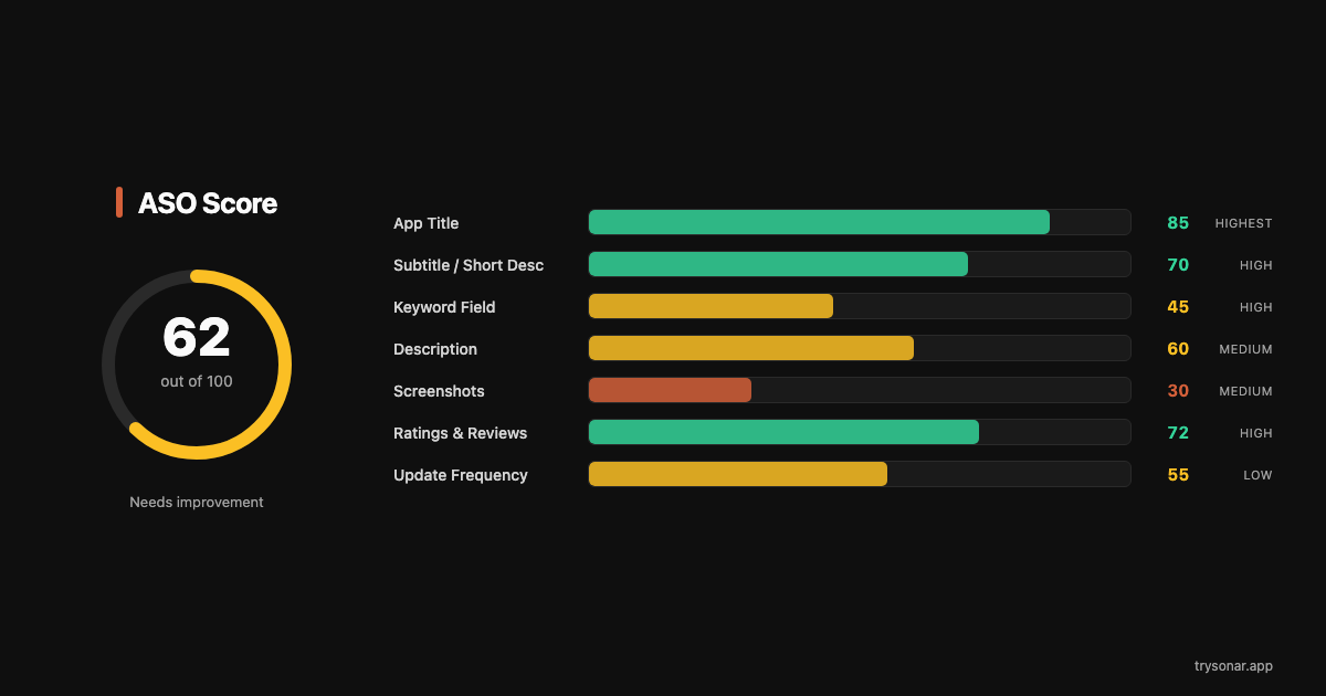
How ASO Scoring Works
An ASO score (0-100) quantifies the overall health of your listing. It's not a single number — it's a weighted composite of the categories above.
What goes into the score
| Factor | Weight | What's measured |
|---|---|---|
| Title optimization | High | Keyword presence, character usage, format |
| Subtitle / short description | High | Keyword coverage, no repetition with title |
| Keyword field (iOS) | High | Character usage, word uniqueness |
| Description quality | Medium | Length, keyword density (Play), structure |
| Visual assets | Medium | Screenshot count, video presence |
| Ratings | Medium | Star rating, review count, recency |
| Competitive factors | Lower | Relative strength vs top 10 results |
What each score range means
80-100: Your listing is well-optimized. Focus on keyword selection strategy and content updates rather than structural fixes.
60-79: Solid foundation with clear gaps. Usually means one or two categories are dragging the score down — often the keyword field or screenshots.
40-59: Significant missed opportunities. Multiple areas need attention. Start with title and keyword field since those affect rankings most directly.
Below 40: The listing needs a full overhaul. You're likely invisible for most relevant search terms.
Which factors have the most impact
Title and keyword fields drive search visibility. Ratings and screenshots drive conversion. If your score is low because of poor keyword coverage, fixing that will get you into more search results. If your score is low because of ratings or screenshots, you're already appearing in results but losing users to competitors.
When to Re-Audit
An audit isn't a one-time activity. Your listing's effectiveness changes as competitors update their strategies, keyword trends shift, and your app evolves.
After every metadata update
Changed your title, subtitle, or keyword field? Audit the listing 48 hours later to confirm the changes had the intended effect. Metadata takes 24-48 hours to fully index — auditing immediately gives misleading results.
After major competitor moves
If a top competitor in your primary keyword updates their listing, re-audit yours. Their changes may shift the competitive landscape. A new app entering the top 10 for your main keyword means difficulty just went up — you may need to adjust your strategy.
Monthly cadence
Set a calendar reminder to audit your listings on the first of each month. Check your ASO score, review keyword rankings, and identify one improvement to make. Even small monthly improvements compound — a 2-point score increase per month means a dramatically better-optimized listing within a quarter. For a full list of what to track, see our ASO KPIs guide.
After app updates
Major version releases are a natural time to refresh your listing. New features mean new keywords to target. Updated UI means screenshots need refreshing. A version bump also gives you a chance to reset your "current version" rating if the previous one was low.
The Practical Takeaway
An ASO audit boils down to six questions: Is my title earning its 30 characters? Does my subtitle add keywords without repeating? Is my keyword field full? Do my screenshots sell the app in 3 seconds? Is my rating above 4.0? Am I differentiated from competitors?
If the answer to any of those is no, you just found your next 10-minute improvement. Run your listing through the free audit tool at trysonar.app/tools/aso-score to get a specific score and category breakdown, then fix the lowest-scoring area first. One category at a time, one update cycle at a time.